Wednesday, November 24, 2010
My Creative CV
The pack consists of four plastic self seal bags that are attached to a sheet of cardboard. This has been designed with my corporate id attached to the hope and uses my corporate colours.
The packages include a dish and set of instructions. I spent some time on this instruction book, as I wanted to ensure that I would be able to convey what we are about as a business and what we can do for our clients.
I tried to use some gardening words and phrases such as germinate, sew seeds, and grow to help tie both the relationship between me and the client along with my promotional idea.
The second bag contained the grass seed itself and the third contains a packet of a miniature green bucket filled with soil.
The fourth contains a set of tools. I first started out by looking on ebay and other search engines for these, however I realised rather quickly that this was going to be a little more difficult. Dolls houses are extremely popular and collectors itemsfor which they charge a small fortune. Bacause of this, I decided to look more into the art and crafts field. I managed to find a company in the United states that sold miniature watering cans and so ordered a 5 and then paid for postage and packing. I then looked for a set of gardening tools again in mimiature which I also had to import this time from Jersey.
Thursday, November 11, 2010
Grow your own grass package
This week I have spent some time designing my artwork for my creative CV. Although the artwork only took me a couple of days to perfect getting hold of products proved more difficult.
I decided to design a CV that would involve the people that I was sending it out to. With this in mind I wanted to create something that was not only hands on but also fun and exciting. I decided to send out a grow your own grass kit. As it is to be sent to offices it had to be small enough to be able to be kept on a persons desk so that it would be a constant reminder of my business.
I wanted to ensure that the link between both myself and my business could be made between what I was sending. Many companies put their logos on stationery for example and they may not have anything to do with that industry.
Although I am not entering the gardening world, as my last name is Green, I intend to as my gimmick to show the correlation in a quirky way. Furthermore the exercise itself is about nourishing and growing something in order to achieve something that the person will be proud of. I want to incorporate this as it is how I see professional relationships between me and my clients.
Developing my corporate ID
The finalised ones can be seen below:
INSET IMAGES!!
I wanted to ensure that I stand out from other professionals within the industry and so therefore needed to think about doing something a little quirky. It is well known throughout all industries that freebies are sent to companies in order to differentiate themselves from competition. These can range anywhere from customised pens to mouse mats to free samples of their products.
I wanted to do something a little different, something that would stick in the mind of the potential client, so that they would remember me and therefore had to come up with a unique idea.
I played around with all the usual "standardised" gimmicks but decided that it would be best to try and link the idea directly to my name, Green.
I finally decided to go with incorporating grass into my idea as this also ties in with my words on my poster Green, Green, Grass of home.
For me growing a business is one of the hardest things that I think I will do. This is only possible with clients and so it is imperative that they understand how important they are.
With this in mind, I set off with thinking about grass seed and it suddenly clicked that I could send this out to the potential clients. However, on second thought this would not be too memorable. I felt as though it needed something more and so decided to provide the client with a more hands on approach.
Tuesday, October 19, 2010
Monday, October 18, 2010
Employability
Although I currently have a job at a studio, it is always important to keep in touch with the market and what employers require within the current climate. I noticed that most of the vacancies are for lecturers both locally and up and down the country. This is something that I may be willing to pursue at a later date.
As expected most jobs are what I would call "one off's". This is where someone is looking for a photographer to provide a specific number of shots for either themselves or for a client for a specified brief.
The market for photography is a volatile one and there is currently a lot of competition from sole traders who look to snap up these "one off" contracts, however, what people are really looking for are clients that have a continuous steady flow of business.
It is very rare that photographers are contracted full time to a studio with a salary and I therefore consider myself to be very lucky.
I am hoping that with my background knowledge, skills already gained from this course and further skills from this course I will improve and have a good portfolio to show potential employers. Although this is not the only thing that they will look for when looking to recruit, it is imperative that it contains the best of my work to ensure that I have a promising chance.
With regard to the other parts of the interviews, I consider myself to be a very open minded, confidant and bubbly person who enjoys life. I am hard working and enthusiastic, and have transferable skills, for example working with people of all ages. This I think comes across when I am being interviewed for potential positions. I have a pleasant nature and am easy going and from looking at several websites this is currently what employers are looking for.
Although a job opportunities are always something to look at, I am currently very happy within my role at my current studio. If I were to leave it would most probably be to become freelance, and is something that I would consider doing within the next 5-10 years.
Friday, October 15, 2010
Christmas door
Layer 1
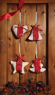
Layer 2
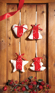
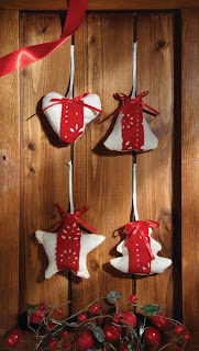
The final image is both f the layers flattened together. The background layer contained the first image. The top layer was used to add extra light onto the berries towards the bottom of the image. I have put a mask around all of this and erased the other layer leaving the rest of the background layer to show through.
The end result can be seen below
F20
1/125
100 ISO
Tomatoes - summer work
Initial image

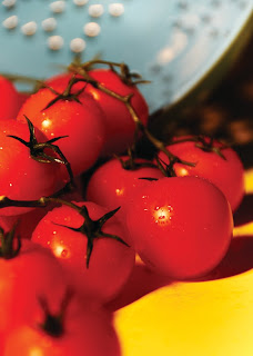
Although I was happy with the lighting I have slightly changed the composition of the shot by moving some of the tomatoes so that they sit better within the image. I have also sprayed the tomatoes with water to make them look really fresh. This is always a good technique when shooting fruits and vegetables. The water droplets also help to disperse light and act like small mirrors helping to enhance the lighting in the shot.
Step 2

I have then highly saturated the image and cropped closer to give it a more portrait frame.
Step 3

Finally I have cropped even closer into the image and take my f stop right down. This has made the colander appear blurred in the background. I have played around with both the Kelvin scale and tint to give a dramatic effect. I have also added a filter in Capture One software to create my final image.
Step 4
Developing my corporate ID
The idea behind this is to give my work a corporate identity. When I then take this to potential clients and they look through it they will be able to associate me with my brand. I am also going to include my design work leading up to my final design of my corporate. This will comprise of a letterhead, compliments slip, business card, envelope, CD, DVD, promotional freebies, calendars etc.
I want to create something dynamic and unique to send out to potential clients and this is something that I will need to think very hard about. It has to be something that is innovative and fresh to ensure that it will stick in the clients mind. This will then ensure that I am thought about when looking for a photographer.
Gold extravaganza
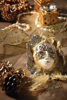
I have tried to use a mixture of textures and different products to help generate my image. I have also included the subtle Merry Christmas message towards the right hand bottom corner. This was I think that it portrays the message without being too garish and in the face of the person receiving the card. Because the image is busy I also think that it allows the receiver to look at the image in its entirety rather than focusing on a specific are of the card .
F 5
1/200 second
100 ISO
55mm
Winter woodland

I have also introduced another dimension to the shot by putting a lit candle into the frame. For this I have had to change my exposure time to about 1/8th of a second and turn off my my modelling bulbs.

F 5.6
1/200 second
100 ISO
62mm
Wednesday, October 13, 2010
Feedback and development of corporate ID - WR3
I have therefore started to develop my letterhead, envelope, compliments slip etc using the same type face, logo colours and concepts.
Having showed Dave my business card online both in colour and in black and white I then had my formative assessment and he wrote,
"Extensive and relevant research material has been developed in a sophisticate and articulate way showing a mature and professional attitude. Excellent effort to date!" Dave Chapman.
This gave me a real buzz and I felt that I had achieved good progress with this module already and am slightly ahead of where I should be.
Over the next week I am hoping to generate some mock ups with several variations for Dave to look at.
Feedback form Dave about Levi Jeans concepts
I received some very positive feedback which made me feel good about the work that I had already undertaken . I then discussed with him and set myself several targets for the following week and will design a time plan to ensure that I complete what I need to do.
"Excellent research has been developed by Charlotte in a relation to explaining a variety of concepts and storyboards. Very exciting range of initial ideas that all have potential to meet the outcomes of this brief in a creative manner!" Dave Chapman.
Tuesday, October 12, 2010
Shoe lace wig!
I have also spoken with several possible models and am trying to get in touch with a make up artist to come down to the studio.
Friday, October 8, 2010
Shoe laces
I started by looking at sports companies and companies that produce shoes including Nike, Reebok, Adidas Converse and Supra and also other high street shops including Garage shoes etc.
I have looked at different backgrounds that the shoes and laces have been shot on and taken note of different angles and perspectives used. However I wanted to come up with something a little more dynamic and creative.
I researched laces on the Internet and found that there are literally hundreds of different types from flats, rounds, fatties, glow in the dark, twin tone, fades and every different colour imaginable.
I started to think about the used of string and cotton and if I would be able to replace them with Shoe laces. I also thought about using shoelace sweets in some form.
I didn't want to necessarily use shoes within my image and so looked more towards fashion photography.
Paper mache hearts.
Some of my initial ideas included making paper mache hearts, paining them red and cutting them in half. I would then use the shoe laces almost like stitches to sew them the halves back together again. This I would shoot with fairly dramatic low lighting using one key light to create a moody style shot.
Hair.
I came up with the idea of making a wig from laces and shooting a model with white powder on her face, black hair (laces) and cherry red lips. The colours will hopefully look really striking and with it being a head shot you will be able to see the ends of the laces on the fringe that I am going to create.
Corset.
Again sticking to the fashion industry I have recently made a corset, which is currently tightened using ribbon. This I plan to change for the shoelaces. The corset would be on the right hand side of the frame leaving the left hand side of the image plain white. I want to try to include 3/4 of the corset so that the left hand side of the persons waist can be seen, the centre of the corset and the shoe shoe laces can be seen and the rest of her drifts off the end of the page.
Fireworks.
With bonfire night looming, I turned my ideas to how I could interpret this using shoe laces. I had the idea to shoot some fluorescent laces on a black background in the shape of fireworks. I wanted to try and recreate a Catherine wheel by wrapping lots of different colours together. Then in Photoshop edit the image and blur it slightly to give it the sense that it is moving and merge some of the colours.
Stitches.
I have also thought about using shoe laces as stitches using fake wounds attached to different parts of a models body. These obviously would have to be the thinnest type that I could find so that it would work correctly. I have ordered some white rounded laces with metal tips. In Photoshop I intend to change this metal tip into a needle
Knife.
The final idea I had was to shoot a large metal knife with blood dripping attached and suspended in the air with a lace. For dramatic effect I would shoot this against black so that the knife, blood and lace stood out prominently.
Jeans research
By doing this it has given me an insight into what works when trying to promote jeans as a product.
I have collected images from different places such as the Internet, magazines, newspapers and looked through different advertising and branding books.
I also thought that it would be a good idea to refresh my memory of the 4 nursery rhymes that we are to use for this campaign; so have printed these off to include within my background research. Surprisingly, doing this has helped a lot as I was able to highlight different words and analyse the rhyme generating several creative ideas.
After doing this, I then decided to look a little further into the origin of the rhymes to see if that would uncover any interesting facts that I would be able to incorporate into my campaign. This had uncovered a lot of information.
Until doing this I had no idea that Humpty Dumpty was actually the name given to a canon that was attached to Colchester's city wall. It was also often a slang phrase used for a 17Th Century drink which consisted of boiled brandy and ale. It is small things like this that I plan on trying to incorporate into my campaign in conjunction with the very well known symbols and ideas that people think about when relating to the nursery rhyme.
Christmas card
To many Christmas is all about the party season, spending time with family and friend, eating lots of rich food and opening presents. I intend to focus on a different angle for the festive season and will use a more subtle approach to create that festive feel.
There are lots of undertones to Christmas that get swept away when focusing on what people now think to be their typical holiday season. Simple things such as cinnamon sticks, oranges and fragrances such as frankincense that relate right back to the essence of the season, and this is something that I want to try and incorporate into my image.
Ideas for the PR brief
One of the key elements to this task was that we needed to go out and find an actual client that we would then gain a relationship with and hopefully build a rapport with.
I have thought very hard about this brief as I it has such a vast area to cover for example it may be a firm wanting to launch a new business or product or documenting an important event in a companies history.
I have decided to contact several small local businesses within my area for a couple of reasons. Firstly I do not want to leave it too late to be able to find a client. Secondly local businesses are close by, therefore getting there will be easy to arrange. I have also contacted a couple of schools.
Thursday, October 7, 2010
Work related learning 3
The brief was one set by Levi Strauss, the jeans company, and it was actually given to a global advertising firm. Their campaign great success throughout Asia and further afield. The same campaign is soon to be launched in the UK and we have been asked to have a look at the current campaign and provide our own interpretation of the brief keeping several key elements.
The first element is the slogan 'little toughies' ,the second is the route - there are four key nursery rhymes; the three little pigs, little miss muffet, jack and the beanstalk and humpty dumpty.
These elements are not to be changed and we are to adopt these, and produce our own take on one nursery rhyme showing the development of our ideas. This will then lead to one final image that we are to show in different situations from a 96 sheet to an Adshell.
My first target to achieve by the end of the week is to research Adshell and find out what they do and what relation they have to the the task. I also plan to look at the Levi website and do a little background research about the company itself, their ethics and philosophy, what they are about and how they operate.
What is PR, and the PR brief
•"A promotion intended to create goodwill for a person or institution"
•"Any activities or events that help promote a favorable relationship between a company and its customers and prospects; activities used to influence the press to print stories that promote a favorable image of a company and its products or services."
After looking at this I was then able to gain a better understanding of what was to be required and what types of businesses I should consider consulting.
Although there are no real guidelines to the brief it is important that I research the my chosen client and contact them soon. I plan on finding some background information about the company via websites, magazines and promotional material, which I will include in my presentation folder.
The shoot.
Shooting on location poses lots of problems and there are many things that I will need to take into account. I will need to look at and talk about the following areas:
Equipment
Light
Location
Time
Costs
Issues
Personnel
Protocol
I will also document the processes that I will use on the day, editing of images, issues encountered, file formats and timescale.
I will then reflect on my 3 chosen prints and critique and will hopefully be measurable by correspondence between me and the client.
Friday, September 24, 2010
Lecture from Steve Howdell
I was quite happy about this as I finally felt like we may be able to gain some more hands on experience. This is something that I was hoping for in the second year of the course, as I thought it was missing from the previous two semesters.
Furthermore I am a firm believer in that everyone practices photography in different ways and thought that I may be able to learn some new and different techniques.
Unlike most of the group before starting college I have already had a lot of studio experience but was interested to see how Steve lights his sets as they are specifically for hair and beauty shots. This is an area that I have no experience in, but felt quietly confidant that if asked to do something similar, I would be able to cope and produce good quality images.
The afternoon started off with a brief background about how he was introduced to photography and it seems that he happened to be in the right place at the right time. This is something that I have found happens a lot in this industry and it is all about contacts.
Something that I did find interesting is that when he signed his first contract with Babyliss he insisted that his name was wo be printed on all of his photographs to gain exposure within the intdustry. This is something that I will push for when looking for clients not matter how big or small the contract.
After the first half an hour of being introduce and looking at a powerpoint presentation of his collection of work, we then went into the main studio for a technical demonstration. It had a very 'student' feel as there was an informal and relaxed atmosphere. It was also a hands on demonstration where people were allowed to take part, which I really enjoyed.
When college is not running my full time occupation is as a photographer and so I am lucky in that everyday for the past three months I have been using one of 4 different cameras. These are a Canon mk2 ds, Nikon d300, hassleblad v and hassleblad h2.
Working full time has been a double edged sword for me as although I have been practicing with a camera I unfortunately have not had a lot of free time to concentrate on shooting what I am passionate about, trying new styles and experimenting with different lenses for example.
I have however spent a couple of weekends in the studio to produce a number of shots. Everything in the image has been selected, cropped and styled by myself with no influence from anyone else. This is something that I have not been used to doing, as normally in my day to day job I am given a brief from a client to fulfil with certain requirements.
Wednesday, July 28, 2010
change of plan
I have never really had the opportunity to dabble into the wonderful world of the kelvin scale and white balance. I have a passion for lomography and am hoping that I will be able to use some of the ideas such as deep saturation of colour along with the kelvin scale to create a series of strong and powerful images of everyday items.
As mentioned previously my portfolio is based more around portraiture/ pack shots and food and I feel that I need to personalise it a little more. I am hopingto do this by using different tools such as hue/saturation/ contrast/ filters and white balance in both Capture One and Adobe Photoshop. I also intend to use some unconventional angles for my chosen everyday items.
Monday, July 19, 2010
Summer project
In addition to this we have been asked us to produce a project on a topic of our choice. As once again there is no constraints to the brief, it has taken me quite a while to decide what I want to do, the format that I want to present it in and also try to do something new and different using a range of techniques.
I have pondered with all different ideas from shooting at different locations, shooting electrical items to photographing sports. Finally I narrowed my choices down to two; summer flower photography and home ware products. I am hoping that I will be able to build a set in my studio so that I can shoot some lifestyle shots using a combination of both of these elements.
My photographic portfolio is based more around portraiture and pack shots and so therefore I have not had much experience with room set photography. I am hoping that by doing this project it will provide me with a great learning curve. I will no doubt l learn a great deal about lighting from trial and error of placing hard head lamps and softboxes in different areas of the set. Furthermore I hope that it will provide me with some good shots for my portfolio that can be used when I finish my degree.
Thursday, May 13, 2010
End of year show
I have spent sometime this week trying to sort out the images that I want to print for my end of year show. I want to ensure that I show a range of different techniques, subjects and styles of photography.
The venue and times for the end of year show have also been finalised and so I have added this information to my poster. My finalised poster can be seen below.
INSERT IMAGE
We have also agreed a minimum number of 5 prints per person and are going to frame our images. We have also contributed to sorted drinks and nibbles for the opening night.
In the last exhibition we did not have any music and so we have decided to make a CD to give a more relaxed and creative ambiance. We are also going to try and contact some of the music students to see if they would be interested in playing a set for the opening night. This will help them to promote their band as well as aid us to promote the event.
One of the tutors has designed an end of year show poster for both the Hnd and FdA students which will be put up around college. I too am planning to putting up several mini posters in the college to promote my work and also send out an e-shot to the rest of the student body using the college emailing system.
Portrait studio
Last week we sat down and made a plan of action where everyone was given a task to complete. This ranged from poster design which was my role, to contacting photographers and organising phone lines and contact details.
Everyone will get the opportunity to cover different roles within the business from assisting, administration and also being the photographer. In order to ensure that the quality of the images are maintained to a certain standard there are also some other things that we need to consider.
Hopefully after our first few customers word of mouth will help to promote the business. People who have visited the studio are likely to show family and friends the work that we have produced. If one of these people then decided that they wanted to visit the studio they would expect something of a similar nature. As we are going to be on rotation with different jobs, it may mean that the person with the photographers role will not necessarily be the person who took the pictures they saw.
Every photographer has their own style and way of shooting however to run this business successfully and allow each person to fulfil a different role some rules and guidelines. This will help to ensure that the quality and style of the images produced by the company are the same. This is something that Venture had done successfully. They have studio spaces and photographers all over the UK and successfully promote a certain "feel" within their photography.
To ensure that we can do this, we are going to set the studio lighting and backgrounds up in a specified way. Softboxes, hard heads and reflectors will be placed in the same spot (which will be marked out on the floor) for all portraits. The same college camera will also be used to ensure consistency in the work that the studio produces.
Friday, April 30, 2010
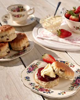
Cream tea anyone?
Over the last couple of days we have had some great sunlight and so I decided to use this to my advantage and shoot using this light.
Critique from a professional
With this information I decided to concentrate on the area of food photography. I shot a wide range of different products and all were shot with natural daylight.
After completing the portfolio I showed it to the stock photographer and listened to his critique. This then enabled me to make my decision for my final three images to submit to the online library.
The following three shots are what I chose to submit.
Mini pizza breads

Afternoon Tea

Raspberry fool
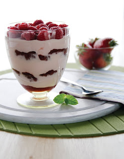
Paul seemed impressed with my shots and said that , "They would be an asset to any photographers portfolio." Although this may have been the case when I received feedback from I stock they stated that my images had been rejected because they were too similar with regard to subject i.e. food and lighting i.e. daylight. I was then invited to resubmit a further 3 images which were accepted. These can be seen below.
Tomatoes

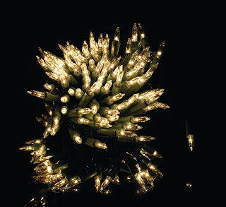
Christmas lights
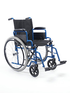
Wheelchair
Monday, April 26, 2010
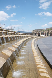
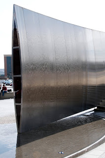
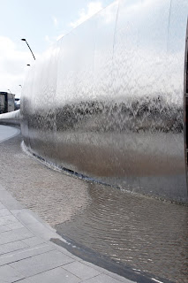
Sheffield on a sunny day!
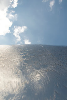
Close to Sheffield train station is a relatively new water sculpture. It is made out of curved stainless steel and looks great when the water runs over it. I chose to shoot this at various angles to show not only how different it could look, but also to see what interesting angles I could make using the same sculpted piece.
NDC - Northern Design Compeitition
Along with the picture we were required to write a short blurb explaining why we have chosen this image.
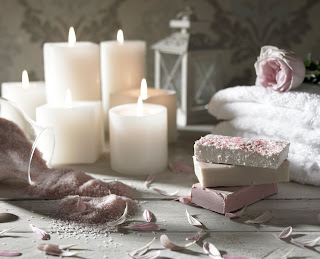
Blurb:
I have been studying the art of photography for about a year and a half and during that time I feel I have made some great progress. For me photography enables me to express myself though using my creative abilities on a variety of levels.
The image entitled ‘relax and unwind’ I actually shot for a college project where we were asked to shoot candles. I have chosen to use this as my entry for this competition for several reasons.
Firstly, I feel that it encapsulates my style as a photographer. Personally I feel that photography relies a lot on composition and is why I style most of my work myself. This is also true for this piece.
I have used a small aperture to give depth to the images so that the back is in soft focus and used a long exposure of about a second in order to capture the flame of the candles. This shows that I have learnt different techniques.
Furthermore I have shot this image using only daylight on the location. This gives the image a very natural feel which I think works well with the style of the shot.
I have tried to use a mixture of textures and a variety of similar tones within the image so that everything works in harmony together. I have also ‘built’ the image using different heights and various materials for example the smooth glass container and the fluffy towels.
In post production I chose to de-saturate the colours slightly as I feel it lends itself well to the lighting of the candles. I made a decision not retouch the shot too heavily for imperfections such as marks on the soap, because I think that it gives the image character and again appears to be more organic.
As I become more self-assured about my abilities, entering a competition has further improved my confidence.I have been able to produce am image that I am proud of and put it against other peoples work, which is quite a large milestone within my short photographic career. I look forward to entering more competitions like this in the near future.
Tuesday, April 20, 2010
Posters
A4

In order for my name to "stick" in peoples heads I wanted to create something on my promotional material that had a double meaning. The most obvious thing to me to do was to play on my surname and so that is what I did using the phrases 'the green green grass of home' and 'green with envy'. It is my hope that the play on words will remain in peoples memories when they see my work and will therefore remember me if they need a photographer.
A3
Poster 1
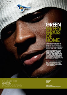
Poster 2
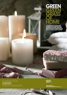
Black and white business cards
Business cards
Monday, April 19, 2010
Reflection of the Exhibition
As this was a group exercise, it was decided amongst ourselves the roles and responsibilities within the team and we were designated tasks to complete before the exhibition. I suggested in one of the meetings that we should produce an A5 flyer that could have been handed out in the city centre to promote the event. This could have also been sent out as an e-shot to all of the students at the three college campuses, as well as to people within the creative sector. The person allocated with this task did not complete the artwork for this and consequently not only did I fell that the exhibition suffered from this, I also felt that as though I had failed with this task, as it was a group effort. In the future when having and idea such as this, I would prefer to follow it up myself to ensure that it is completed, as I felt that this would have made a big difference to the event.
I also had the idea to produce a banner that could be put up in the centre of Wakefield in order to generate interest about the exhibition. With it being in a public place I had to get clearance from the council that it would be OK to do this, which was granted. Again this is something that I will in future push to ensure happens, especially if it were to be done for the end of year show.
I believe that the exhibition could have been marketed and promoted better in several ways even with a lack of finance. Earlier in the semester we discussed talking to the local radio and newspaper stations for coverage about the event which would have hopefully created interest; however for one reason or another task did not get completed. This is something that I would want to do if given the opportunity again, as I think it would have increased the amount of people at the event, and I will put a lot of effort into for the end of year show.
It is my hope that from hosting two previous events that we will be able to draw on our strengths and reflect on our weaknesses and make these stronger for the end of year show. I hope we will be able to promote both the event and ourselves better and improve links with the creative industry, so that we will be able to invite other photographers and clients to the event.
To ensure that there will be more people we have started a Facebook group for the end of year show and have sent invitations to family, friends and professionals. It has also provided us with another style of communication within the group. This is a bonus as there were several occasions where not all members of the group were there and missed out on important decisions. I also plan to use the database of contacts that the group compiled when setting up our media agency to invite people to the event.
Reflection on planning a media agency
I now know how to construct a successful business plan by using several key models i researched. In addition to this I believe that I have gained a lot of skills for example how to produce an effective SWOT analysis and how this it can be used in the planning stage. I am now familiar with the needs and requirements of planning and the stages and processes of how to become and fun a successful photographic business, and am confident that this information will be useful to me for the future planning of my business. I have also gained insight into new models for problem solving i.e. the Fishbone model.
I see myself as an entrepreneur in the making and although the media agency was not a success I see this as a learning process and am willing to accept all responsibility regardless of the outcome. Since studying this module I now have a clearer idea of enterprise, markets and how to be successful within them.
Exhibition task
After being told about the task we sat down together as a group and started to plan the exhibition. This part of the project seemed to improve on our previous performance and made me feel more confident about hosting the event.
It was important to identify who we wanted to come to the exhibition and know how to target them. It was decided that the target audience for the exhibition was the general public and although there was no specific group, I felt that it was important to try and gain some people from the industry to come along.
I contacted several photographers by both email and telephone within the local area but unfortunately none of them were able to make the event. This would have been beneficial as I wanted to gain some insight into the industry, ask for feedback from locally respected photographers and also market myself through my work with a view to networking with people in the creative sector. Fortunately other people within the group were able to invite their family and friends and I was able to gain some great feedback from them, as well at that from the general public who dropped in one the event.
Although this was a group task, there were some decisions that I needed to make individually, one of which was to decide what type of work to put up in the gallery space.
For the first exhibition in semester one, I put a mixture of portraiture food and architecture architectural photography on one wall. I did this to show the variety of work that I can produce. However, this time I opted for a more minimalistic approach and had a theme to my work. I decided to use skin as my theme and only used three images one of a white female, one of a black male both done in monotone and the final image was both high in saturation and in colour.
Furthermore in my first event I put my work on the wall without a boarder or frame. In hindsight I feel that this was a mistake as it did not look professional and for that reason I chose to frame my work using simply and stylish black frames.
After a couple of weeks of planning the exhibition and the issue with financing this project, I noticed that the morale of the group decreased and I found it very hard to keep people motivated. The work that had been designated to people was not being completed for unknown reasons and the deadline was looming ever closer. With the prospect of the exhibition turning out like the previous one, I really wanted to keep the morale of the group high as I feel it would have had a positive impact on the success of the exhibition.
Planning a media agency
We have only had to work as part of a group on a number of occasions during the first year of our course and as I have a good working relationship with all members of the group I am looking forward to the task and seeing what we are capable of.
I knew that this challenge would require a lot of work both individually and as a group and looked forward to working with the other members. I would regard my ability to work in a team as strong, and this was shown in the questionnaire I filled in about my strengths and weaknesses during the first semester. However, communication and teamwork are skills that I am continually trying to improve, as working with different types of people helps me to be a more rounded individual and inspires me to think about problem solving in different ways.
Processed films
After I received the films back I had a mixture of emotions, firstly I was pleased that the films had been processed and that they were not ruined. Secondly I was glad to see that the images turned out. I did however feel a little sad that they were not as bright as I thought they would be. This obviously is down to my error when exposing the film, but as you may appreciate there are only three settings on the very basic camera.
If I could re-do this project, I think I would have tried to order the camera and films a little earlier and had a practice session with the Saturday market. It was relatively close to the deadline (2 weeks) that I decided I wanted to look at shooting my images this way and with the camera having to be shipped and the weeks processing time for my films, it did not leave me much time to practice. Practising may have been able to prevent slight issues with things such as exposure as I mentioned earlier.
Film photography is expensive. It cost me £55 to have one black and white film and two colour films processed. As there are only 12-14 shots on a roll of 120 mm film it meant that I did not have the budget to be testing, processing and printing a lot of films. I am sure that in time my technique will improve as I continue to practice the art of Lomography in my spare time as it really is something that I have become passionate about.
I will be posting some of the images on my blog soon once I can scan them in.
Reflection on the design of promotional material
Although I currently work within a design agency in the photographic department, I rarely get the chance to see what people actually do with the images I generate. Now that I have completed this task I understand the processes of what some of the people I work with do. It has been a great learning curve both in understanding a different angle to the business I work in and also has shown that I have strengths in other areas.
I feel that I have gained valuable knowledge and learnt new skills by using in design, in how to co-ordinate promotional material so that it helps to create an identity for myself.
I plan to use the skills that I have learnt during this task to produce something similar to what I have designed when I set up my own business.
Promotional material plan
The first thing I did was to look for an image that worked both in colour and in black and white. I spent considerable time on this, as it this may be the first time that someone sees material that links me to my business.I wanted something that was quite neutral and not too striking yet showed my abilities with relation to photographic practice and so chose a spa themed shot as it showed my skill with lighting.
As my last name is Green, I thought that it would be a good idea to use this as a base colour for my promotional material. I spent several hours playing around with different colours and saturation in order to gain the desired effect.
For the type face I wanted something that was both easy to read but yet bold and made a statement. I also wanted to create some depth to the text and so have used different percentages of colour to create this.
I think that it important not to put too much information onto postcards and business cards as they are relatively small and I did not want it to appear like there was too much text. Because of this I kept it simple and straight to the point and added my name, occupation, address and contact details both for my mobile and email.
Promotional material is a great way to become recognised and so I also included a web address. This allows potential clients to look at the type of work I produce before contacting me in person.
Furthermore it helps to show the type of clients that I am currently involved with. Some clients like to know that you can shoot their type of products for example fashion or food photography and by having a range of images on my website they can see what type of shots I produce within their area.
Sunday, April 18, 2010
My first 120mm films
As there are only three settings on the camera, there was a little bit of luck involved when I exposed the films and although I am please with learning a new skill I feel it is something that I may have to practice with a little more.
With regard to personal progression, I have been introduced to a whole new world of photography and it is something that I would like to focus on in the near future.
When at the market I also took several captures using my digital camera (Nikon D300) and have tweaked the RAW images in capture One Pro. It made me realise just how much easier it is to capture events using a digital camera as I could see the shots instantly. whereas in contract i could not with the film camera.
I was relatively happy with the shots I took on my Nikon and have decided to include several of the images in my series of final prints because it shows that I can use a range of mediums to document an event. I will be posting some of these onto my blog this week.
Promotional material
The first key element that I wanted to cover was to appear professional. The type of artwork, pictures and graphics used on promotional material can have an effect on the way both a company and individual is portrayed within the creative sector.
building a rapport with clients is important and before meeting a photographer face to face. They will usually look either on the persons website or have seen some of their promotional material.
Before starting the task of designing the promotional material I had a look at what was already on the market from competitors and other agencies. I spent quite some time looking at the different businesses and recognised one common trend, whether it was a sole trader, a micro business or a large agency. All of them had three ways in which they promoted their business which were posters, postcards and business cards.
Over the last couple of weeks I spent some more time thinking about what images I wanted to incorporate onto my material as this would reflect the type of work that I do. Currently, I so not specialise in any particular area of photography for example high end fashion or weddings, however I do want to become a recognised professional all rounder.
Because of this I decided that I would introduce different areas of photography onto my postcards including portraits, food, fashion and product photography. The main reason for this is to show that my skills are diverse and I can adapt for all clients. This became my second key point of focus to portray to industry.
Furthermore, I wanted my promotional material to have a theme. From personal experience I think that when information is sent out from a company that it should be instantly recognised almost as a form of branding. It is what the person stands for and helps to define the type of person that they are.
I also made the decision to keep the same colours and font styles for all of my promotional material, as I think this helps people identify with a company and will hopefully leave a lasting impression.
Monday, April 12, 2010
Lomography at the market
Loading the film proved to be slightly more difficult than first expected, however after some perseverance I managed it. The weather conditions were also ideal and I spent about two hours and three roles of film taking pictures.
As first experiences go I really enjoyed using the camera and film and tried suggested techniques like shooting from the hip so that people are not aware that they are being captured. It brought a degree of fun to the project and opened p a different angle to photography for me.
I have sent films off to be processed and cannot wait to see the results.
Thursday, April 8, 2010
Diana F+ and lomography
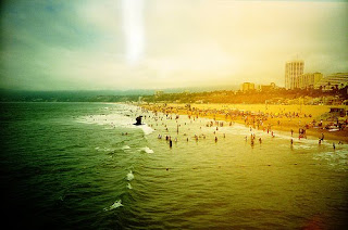
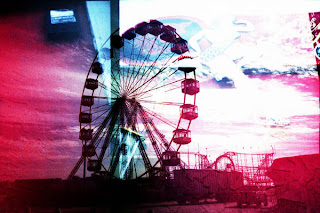

When looking at a lomography everything in the picture appears to be amplified and detail is enhanced. The saturation of colours appears a lot deeper, and the film gives a grainy effect and because of light leaks allows for a shadowy vignette that frames images. I have also bought a fisheye lens and plan to experiment with this to produce some interesting shots.
Brief for istock
This obviously will take a lot of planning and will be very time consuming and so like always my time management will be under pressure.
I want to create a range of shots that have different techniques for example the style of lighting used. Some I will shoot in natural daylight, others will be shot in studio with flash, tungsten or a combination of the two. I also plan to use a variety of angle and close ups within my selected images.
For the food shoot I want to shoot a variety of products using different backgrounds and props. I want to try and achieve 5-6 different shots and plan to shoot over several days to get the best that I can from my abilities and not rush the project.Because food photography takes some time, I have already planned what I will need and have started to assemble the props together. To ensure that the food is very fresh, I will buy it on the morning of the shoot and cook it in the studio kitchen. This will also take me quite sometime as I am fulfilling the role of a home economist as well as the photographer, and so I will have to factor this into my timing plan for the day.
Tuesday, March 23, 2010
New brief
I decided to have a look at the type of images that websites such as shutter stock and istock already have. In doing this, I stumbled upon the do's and don't page. This proved to be insightful as it explained what images they were currently looking for and the type of images that they had a surplus of.
Examples of what they do not need:
Flowers
Flags
Close ups of eyes
Sunsets and clouds
immediate environment
Examples of what they do need:
Corporate shots
Groups and teams
Sports
Food and beverages - preferably with someone holding them
The websites also have strict rules about format and sizing of images along with a standard of quality. These are all things that I need to take into account when looking at what I am going to shoot for this brief. I have decided that as they have stipulated certain areas where they require images, I would use this to my advantage and produce a series of shots within these groups.
I plan to sit down within the next few days to narrow down what intend to shoot and plan how I am going to produce my shots. I am likely to need models especially if I am going to shoot a sport or corporate events. This I will have to factor into my time plan as the people I will need may have a tight schedule and only be available at certain times. This is something that I am now more knowledgeable of after completing the dancers shoot in the first semester. I also want to plan in at least one week where I will be able to retouch and finalise my image selection as I usually feel I do not leave enough time for this.
Genre photography plan
This specific genre of photography has a wide scope almost anything can be documented. I have decided to document Doncaster's market as it is local to me and also used to be a place thriving with activity. Ten to fifteen years ago people would travel from neighbouring towns just to visit the market and it is one of the things Doncaster is famous for. With the current economic climate and an increase in supermarkets, the trade is becoming harder to survive in.
I am hoping to capture this in some of my images and also get some candied shots of the everyday people that work on the stalls.
I have specifically purchased a Diana F+camera and several rolls of xp2 400 film. I have not shot using film for about 6 years and have only shot using 35mm. I have never used xp2 film before, so thought that this would be a good challenge and ideal opportunity to test a different format. I have also purchased a fisheye lens for and hope that I will be able to create some interesting shots.
As I mentioned before I am shooting at the marketplace. I want to give the impression that these shots were taken sometime ago, giving them a retro feel like that from the 60's era. I am hoping that when the film is developed it will produce some imperfections in the colour, as this sometimes happens when using C41 chemicals to process black and white film. Again this will help to ensure that the images look dated.
Friday, March 12, 2010
Pricing of jobs - how is it done?
Quality of the work required- technical ability
- Quality of the work produced
- Quality of product wanting to sell
- Expectation of the client with regard to quality
Volume of work required
- Client will expect a discount especially if used on a regular basis
- Economies of scale with briefs where there are repetition of shots
Photography time
- Add 10% as a safety blanket
- If regular work e.g. weekly, it is even more important
- Set up and dismantling time of set
- Invoicing, Meetings, discussions, phone calls may be built in to the invoice
- Travel
- Collection and delivery of product
Ability to pay
- Terms of payment - End of month, deposit etc
- Make sure you are paid
- Prior to costing work how quickly client will settle invoice - T and C's
- For payments over 30 days add interest
- How secure is the client - is their business doing well? Are they stable?
- Consistent work flow (also gives stability and confidence of payments)
Competition
- Quality and prices of competitors work
- Need to know if quoting against a supplier
Price with consideration
- Want to ensure that this is accurate
- Do not give this out over the phone.
- Take information and think and get back to the client
Materials and costs
- Model fees
-Set building
-People used to assist (stylists, home economists etc)
Add on services
- Format of the images
-Retouching
-Post production work, supply prints
Has to be worth it
Charge a figure you are comfortable with and feel is accurate
Have to make enough on it - margin
Although I was aware of how to charge for my own personal time for actually taking pictures, there were some factors that I did not consider which were bought to light in this session.
After breaking down the different areas, it gave me a better understanding of how to price future jobs in order to both make money and also ensure a fair price for the client. This can help to secure further work as they would be more likely to consider using me as a resource for further briefs.
Role play between client and photographer
I have already had first hand experience with a couple of clients from personal recommendations to take some portraiture shots. Furthermore, I have also had the benefit of being able to engage with clients from all different companies at my current workplace on a fairly regular basis. Because of this, I felt that I had a good background to work from for this task.
I have prepared this type of exercise before in my last degree and felt that I gained valuable experience from this practice as it has already helped in many situations in everyday life and even job interviews.
Communication and the way the you are perceived by clients is extremely important and providing them with the answers they need is integral in helping to secure work.
I found the exercise both beneficial and helpful as after watching a couple of other groups I was able to pick up on and use some of the techniques that others had included in their sketch.
Wednesday, March 10, 2010
Working with others and communication skills
Esquires coffee houses are a current client at the studio where I currently work and so I already had some links with the company. However, the coffee house that I wanted to use is a franchise and so it was necessary to speak to the owner directly. About a week before I popped in to ask if it would be OK to use the coffee house to shoot some photography. I also suggested that in order for this to be the most successful it would need to be and least disruptive to the business that it would be easier to shoot either before or after opening hours. In addition what I also found helpful was that he was willing to provide me with a number of drinks that I was able to use in my photographs.
With being involved in the industry before enrolling on this course, I have had a substantial advantage in that I am in an environment where I meet clients and also see how other photographers handle their clients and see how the process works.
Having good relations with both clients, the general public and work colleagues is very important and good communication can go a long way within the creative industry. It is at times like this when I realise how important this is. Communicating with other people is something that I feel very comfortable with and will try to maintain this.
Time management skills
I made the decision to use my next project to both try and improve on and meet this target. One of the modules called skills for meeting client briefs involved the Huhtamaki brief. As mentioned previously in my blog entries this was to shoot a series of images of coffee cups both on location and in studio.
In order to get the best result from this experience, I decided I would need to sit down and plan each of the studio shots individually, write a list of props needed before the shoot and have a rough idea of how I wanted to light the image in order to ensure that I used my shooting time wisely. Although this took more time initially at the planning stage, I found that after doing two out of four studio shoots it has saved me time in the long run as I knew the more about what I wanted to achieve.
This is a technique that I plan to use in the rest of the course and for also for the other modules.
Shooting on perspex...
Perspex, especially dark colours for example blue and black are not the easiest of backgrounds to shoot on, as it is highly reflective. It is not something that I have had a lot of practice and it took me a while to get the lighting just right. I also had to use a set of background poles with a role of Colorama at the back and hang it over the top of the set so that the ceiling and lights would not be reflected into both the product and the perspex. This can be seen in my illustration below of how the rig was set up.
I have kept the minimal yet dramatic lighting in order to enhance the product within the image. The capture was shot at 1/125 and at F20 on a Nikon D300 using Elinchrom lighting with the pack at 3.6. I have only used one key light from the right hand back corner of the shot. I tried several different configurations and some examples can be seen below.
ADD IMAGES HERE
Upon reflection of this process, I feel like I have increased both my knowledge and skill level of how to shoot on perspex and it is something which I think I will be using again within the near future.
Friday, March 5, 2010
Photoshop extravaganza
Photoshop is a great tool that a lot of people within the creative industry use to enhance their images, however I have not had any training on it. I have noted this as one of my weaknesses and want to improve on this throughout the course.
On a scale of 1-5, I would probably rate my current skill level as a 1-2. I have set myself a target to increase my skill level to 3-4 and hopefully become a little more comfortable with the software.
Although there is no specific sessions of how to use Photoshop in my modules, I think that with practice and perseverance I will be able to increase my knowledge and use it effectively.
A couple of weeks ago I bought a book on how to do the basics within the software and decided to have a go to see what I could produce. I have learnt how to change curves, levels, add layers and mask selected areas of an image.
I have also been watching videos from youtube to aid my learning as there are many workshops and helpful hints from what people have posted.
I have set aside two hours a week to practice these skills. In addition to this I also work with someone who is very proficient at using photoshop and am hoping that he will be able to show me some of the tricks of the trade.
Thursday, February 25, 2010
Characteristics of my brain!
An individual’s dominant brain type has a very significant affect on the way they study, homework habits, and grades. Some students may struggle with specific assignment types or test questions, based on their specific brain types.
By understanding my dominant brain type, it will enable me to adjust my study methods and help to schedule my work to suit my own specific learning style.
I took a test online and found that I am slightly left brain dominated. It says that “You probably like some order in your life and in the classroom. You are comfortable listening to lectures and taking most test types, but you might be uncomfortable with open-ended essay assignments that require you to imagine scenarios. You want class directions to be clear. A disorganized teacher or unclear assignments will drive you crazy! You are good at analyzing problems to find the right answer. You may have considered pursuing a degree in science or math. You don't like mushy love movies. You might be a Jeopardy champ one day, not because you're smarter than right brain students, but because you are able to answer questions quickly. However, you also possess some right brain qualities therefore giving you a more middle brain orientated outlook.
You probably like some order in your life and in the classroom. You are comfortable listening to lectures and taking most test types, but you might be uncomfortable with open-ended essay assignments that require you to imagine scenarios. You want class directions to be clear. A disorganized teacher or unclear assignments will drive you crazy! You are good at analyzing problems to find the right answer. You may have considered pursuing a degree in science or math. You don't like mushy love movies. You might be a Jeopardy champ one day, not because you're smarter than right brain students, but because you are able to answer questions quickly.
Characteristics of a left brain student
Work with a to do list
Like to be the critic in the class
Good at maths or science
Rational and logical
research is precise and well-documented
Set goals for yourself
Interpret information well
Room is orderly
Answer questions spontaneously
Follow diresctions and do read directions (unlike some people)
Prescise
After doin this test and looking back at my personal preferred learning style which is visual I can see that there are some similarities for example both suggest that I like to make to do lists which is very true. Furthermore, it also sugggest that when researching I am very precise and document things to a high level. This was seen as a strenght when I tool the 1st questionnaire to find out where my strenghts and weaknesses lie.
When looking at this information and comparing it with the visual style of leaning, there are some clear similatrites such as good organisation and writing to do lists.


